Note: To see previous Friday Fun posts, click here.
One of the more interesting and popular ways to increase density in historic Single-Family-Housing neighborhoods is to allow a carriage house toward the backside of the lot. Often, the new residence will sit on the second floor of a new garage for the property. This has been occurring with relative regularity within the urban core, so it wasn’t surprising to see such a proposal to this Victorian on Park:

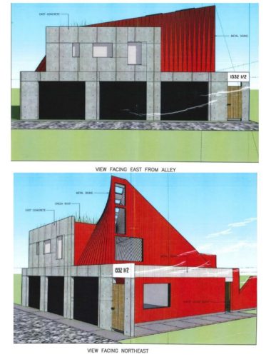
However, this carriage house in particular jumped off the latest IHPC agenda (page 113):

The IHPC staff issued these responses:
THE DESIGN DILEMMA Staff has struggled with this design. There is no precedent for a design of this nature. On the one hand, as an individual artistic piece, it appeals to our modernist side. On the other hand, staff finds it difficult to define how it “appropriately†fits on this location, given the Old Northside Guidelines. Below are the guidelines for New Construction in the Old Northside Plan. We have highlighted the parts of the guidelines that staff find problematic with respect to this design
Although new construction should be done in the contemporary style, it should not detract from the historical fabric. New construction can and should relate to the historical quality of the area through similar use of form, texture, materials, color, etc.
New construction must pay deference to several standards of scale in order to maintain the district’s personal qualities.
Since the silhouette, shadows and multifaceted surfaces (or lack of them) create much of the interest and continuity of historic structures, all new construction must be compatible with the existing outline of surrounding buildings.
The building materials which are exposed to public view should harmonize with the traditional materials, uses, colors, textures, proportions, and combinations of materials original to the Old Northside. The physical composition of the materials may be different from that of the historic materials but a complementary appearance should be sought.
In addition, this situation does not meet the criteria for a Certificate of Authorization
According to the IHPC record, this design has been continued on to the next meeting. It will be interesting to see how much, if any, of this eye-catching design will make it into any potential second round of proposals.
It’s a bold move, cotton, let’s see how it plays out.
Look at me micromanaging the Urban Indy coterie from 700 miles away…perhaps this could be another chance to initiate a door-to-door survey in Old Northside to see who is willing to translate his/her passion for contemporary design into town-hall advocacy?
Thanks for bringing this to light, Kevin.
I’m from the “form follows function” school of architecture. As a result, and in consideration of the Old Northside design guidelines, I personally would advocate against the approval of this submission. It would be one thing if the main dwelling were of a similar aesthetic, but it is not. Instead, it simply looks like something Frank Gehry conjured during a severe bout of angry contrariness.
This carriage house does not complement the main house. It seems like the architect is trying too hard or is trying to be edgy for the sake of being edgy. It doesn’t look particularly beautiful, elegant or clean. Does anyone know the purpose of the weird swooping protrusion?
it’s the architectural equivalent of “jazz hands”
Haha! Comment of the week!
A Google image search for “modern carriage house” shows a number of different ways they could design something that is clearly of its era but also is complementary to the existing buildings. This looks like the bastard child of brutalism and the Mickey Mouse Clubhouse. I’m not a fan of using architecture as a finger in the eye, particularly in a residential neighborhood, but I look forward to hearing how we’re all reactionaries and rubes for not recognizing the genius.
I have no problem with contemporary design, but to me the proposal reads commercial storefront, or perhaps even small community theater building with the odd swoop on the front.
There is nothing that reads secondary residence. It doesn’t appear residential at all.
Keep the contemporary design, just come back with something that looks like a guest house/in-law unit.
I’m late to the game, but wanted to add that the top of the “swoop” is probably a heat tower. its used as a passive cooling element, allowing heat to rise and escape through the taller part. the design of it was an attempt to hide a tall tower sticking out of the box, which in my experience has been hard to do…but at least they tried.