A mostly innocuous-looking building at Alabama and New York Streets is undergoing a major renovation project. Formerly housing only a law firm, the first floor is being converted into a bank.
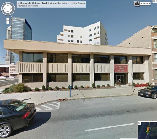
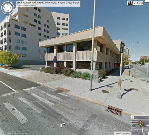
Here is what it used to look like, courtesy of Google Street View:
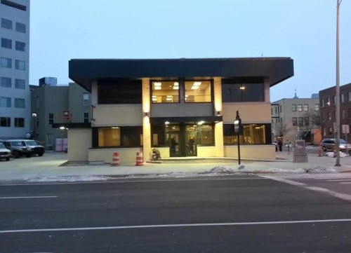
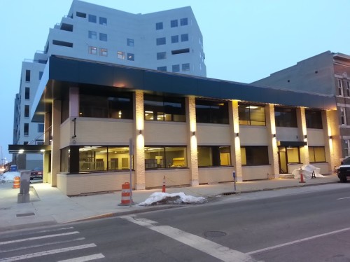
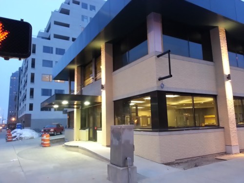
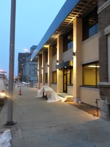
Here is how it looked, as of this morning. Â Notice the new ADA-accessible entrance on the south side, which appears to be included tastefully:
There are probably critics who will lament the loss of the concrete facade, as a testament that some developers still have not learned the lessons of the past with regards to appreciation of our city’s history. Â In this case, I am not among them, and I think that opening up the structure to the street and lighting it in a tasteful manner well help the building seem more active than it had previously. Â Unfortunately, the interior doesn’t look as well-crafted, with acoustic paneled ceilings and fluorescent lighting. Â But on the whole, turning the structure from semi-private to semi-public should probably seen as a win for the corner.
Count me a critic. That’s two Brutalist buildings ruined within blocks of each other (IPS HQ is the other).
They could have done the entrance revamp and the lighting without ruining the distinctive facade.
The concrete ridges were a distinguishing feature, and removing them just made the building bland suburban office park in nature. Those ridges could have been lit with white or colored lights from above (downlights under the wide roof eaves), or from the sides of the pillars, to good effect.
This may just be a personal preference, but I’d pick a clear glass door and canopy over a door-free facade every time. Public interaction leads to an increased feeling of public safety.
Kevin, I wasn’t clear: I agree that the additional entry door is a good thing.
My argument with the designer’s work is that (unnecessarily, in my view) getting rid of the building’s one distinguishing feature just makes it, well, undistinguished.
It seems that what the designer was trying to do was dial the clock back to the 50s or 60s to get a Prairie-derived Mid-century Mod look…but they left the overhang as-is. Its cellular concrete structure is more characteristic of the late 60s and 70s (Brutalist era), but with the concrete ridges gone from the facade, that’s the last period indicator. They might as well have done the whole “modernization” job and covered the recesses up with vinyl or fiber-cement soffit.
I realize a lot of this is subtle and picky, but UI has rightly decried some of the “modernization” (butchering is more like it) of early 20th-century architecture through the 50s, 60s, and 70s. IMO this is the same thing. This was “good” Brutalist and a sensitive adaptive re-do was called for.
Hmm. I spoke too soon. In looking more closely on Google Street View, the redo has apparently exposed a previous cover-up of the “cellular” (waffled) overhang.
Now I wonder if the ridges were unoriginal, just tacked-on Dryvit/EIFS over an original flush brick surface in the 80s or 90s.
Okay, I might be wrong, and this might actually be a restoration. 🙂
I wish I could better recall what happened as they removed the existing material from the structure. It was fairly well blocked off at that point.
I’d have to agree with Kevin on this one. The cookie-cutter suburb is today’s Brutalism – culturally significant for its time, for sure, but worth moving on from. In any case, looks like a good retrofit.
As someone who walks by by this site everyday, I can say that compared with the previous building, this makes for a much more comfortable and pleasant environment. Maybe the old structure just needed some color variation and architectural lighting as Chris mentioned, but from an experience point of view, what they have done is an upgrade.
How do you get Brutalist out of the original? No concrete in sight. Cheap faux stucco or some such. I bike by it twice a day. The tacky veneer of the original iteration of the structure was quite obvious during this project.
My mistake…I was relying on drive-by memory, which obviously is no substitute for walking by on the sidewalk. The EIFS actually did a passable job of mimicking a Brutalist look from a distance, and I wrongly assumed it was real.
Funny, in a way, that anyone would have done fake Brutalist.
I agree with all who like the redesign and regret the “knee-jerk Preservationist” reaction. It’s hard to tell what this building ever looked like “originally”.
I learned something as well, thanks DeeLund. Now I have even more reason to like the change.
I hated the old version of the building and really like the new. The lighted columns look really nice.
Big improvement.
There are a handful of Brutalist structures that are site appropriate, attractive, and functional, and there are even fewer Brutalist “masterpieces.” Most Brutalist architecture is not worth saving. Just because a building reflects a certain period of time and a certain style doesn’t mean it is good architecture.
Aside from the fact that the building in question appears not to have been an original Brutalist structure, there is the larger issue that it was an ugly and uninviting structure. The renovated look may be derivative, but it certainly makes for a more attractive and inviting structure that is more engaged with its surroundings. Before the renovation, the building said, “Stay away!,” and now it welcomes passing pedestrians, and even catches the eye of a motorist driving by.
Fully agree.
Though a Brutalism review is probably for a separate thread…I’ll start one since we launched from “fake Brutalism”.
I think the IPS Ed Services Center was one of those “attractive and functional” buildings until IPS cheaped out on redoing the parking screen. It does a good job of repeating the formalism of the nearby Legion Mall while having human scale and accessibility at ground level.
Obviously the Minton-Capehart Federal Building is a step above “attractive and functional” and might actually qualify as a masterpiece.
There is another decent example at 1712 N. Meridian, which appears to have been altered to add the bank space, but in a complementary fashion.
One that will probably not be agreeable to everyone is the 1969 lawyer office building diagonally across Washington & Delaware from the CCB. While it lacks street-level windows, it does have a reasonably inviting main entry on Washington and an overall “stately” downtown office look. The negative is the “blank” entry on the Delaware side. And the building loses a little without the funky mod “Zipper building” next door no longer funky mod.
Then we have the Lugar and Barton Towers and annex.
Besides all those structures, I’m not sure where else there is surviving Brutalist work downtown. The Bank One Op Center is gone. Keystone Towers are down. The state office tower (now Government Center South) was highly modified when Government Center North was built, and together they reflect more of an “80’s Corporate Center” vibe. Maybe the OneAmerica Tower? Downtown Hilton (highly modified at ground level)?
I agree with most of your assessment here. The main problem I generally have with Brutalism is not its form (which, admittedly, I don’t usually care for) but its function. For example, the Minton-Capehart building kills an entire block of Delaware.
My personal favorite Brutalist buildings in Indiana are Clowes Hall and the Musical Arts Center in Bloomington (like the Minton-Capehart, designed by Evans Woolen). But that is mostly due to their lush interiors.
More precisely, Minton-Capehart’s garage kills the block of Delaware.
No matter how austere and uninviting it is (especially in the context of its otherwise pedestrian-friendly surroundings), you will never be able to get me to dislike Boston City Hall. I think it’s a beautiful Brutalist building.