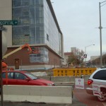
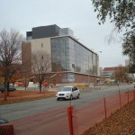
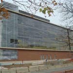
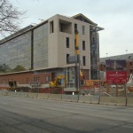
The Glick Eye Institute is currently under construction on the IUPUI Campus. The top 3 floors of it are an attractive arrangement of glass, but the entry floor is mostly a blank wall of bricks. I believe this is more of a statement of the current auto-orientation of Michigan Street than anything else. Walking around the area feels dangerous. Regardless, I thought I share the photos that I took last week What do you think?


It looks like a building that one would find on a college campus, which it is. I don’t think its bad at all.
I love this building even though there is very little street orientation with pedestrians. I guess the campus needs to become pedestrian oriented before this actually happens in 10+ years. This building looks like a great example of Indy’s mid-century modern architecture that was renovated and made modern. I love the assymetry and depth the glass arrangement displays. Finally, a true example–along with the new student center–of an architecture type that would make IUPUI feel like a TRUE URBAN CAMPUS. I hope this trend continues with new infill development at IUPUI! Wow, there are a lot of holes and parking lots to fill. Bring on the residential towers next, PLEASE!
Chicken, or egg: build urban-friendly buildings to change the street feel, or change the street?
.
Walnut and Chestnut through the University City area of Philadelphia function just like Michigan and New York in Indianapolis. They’ve been one-way for at least 50 years. For an example, go to 3200 West Walnut St., Philadelphia in Google maps, then engage street view.
.
Wanut is one way westbound; 32nd is approximately the beginning of the UPenn campus. The most pronounced effect starts at 34th, the beginning of the old campus core. Most of the buildings on the south side of Walnut date to the 60’s and 70’s and turn inward; their loading docks and blank walls face Walnut. On the north side of the street, new buildings (those build since the 70’s) are totally oriented to the sidewalk (as were the old commercial and residential buildings they replaced). Back in the 70’s, Penn was knocking down those buildings and land-banking as surface parking (sound familiar?). Walnut was a boring, unpleasant place to walk. Today it’s different.
.
My point: change the buildings to something more urban, and it changes the feel of the street. When there are people and things to see, traffic slows. When things are set way back across lawns (and when people travel in gerbil tubes), traffic speeds.
Yes, inward oriented high density urban buildings along the main thoroughfares. Any outward orientation (connecting people with the street visually) could be addressed with modern, transparent walls on upper levels of the building. While a building’s lower level directly connects people with the closed in ‘lawns’ or in IUPUI’s case, ‘urban pocket parks’. Great idea for transforming IUPUI within it’s current context.