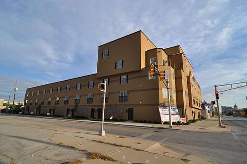
In the fall of 2009, an infill development on the west side of downtown Indianapolis caused a stir with local urbanists. The DiRimini, or as it was called early on, Sarajo Commons, was set to take an empty lot on N. Capitol Avenue. The project is targetting IUPUI students and potential downtown dwellers. Finally, someone was stepping up to fill in one of the many vacant lots on this side of town. The parcel in particular, was located along 733 N. Capitol Avenue, a former grassly lot that had sat vacant for years.
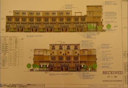
When the initial plans were submitted to the Metropolitan Development Commission, the project looked like a win. Frontage to the street. Proper scale. Lots of windows and plenty of decoration to flesh out the buildings public faces. And located in the rear, would be parking. By all measures, a successful looking submission for this parcel. The massing is particularly strong for a small structure. 5 stories along Capitol Ave.
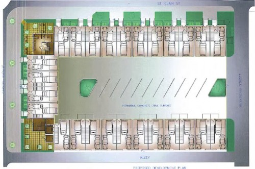
When work got underway last winter, Urban Indy’s own Chris Corr kept tabs on it over at his old blogsite. A couple posts of early construction can be seen here, and here.
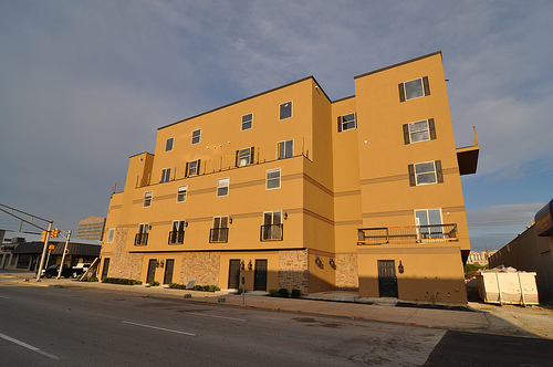
Fast forward 7 months to present day and a casual observation of the new development will tell you immediately that something has went wrong. The project we have recieved only vaguely resembles what was submitted to the city last year. A comparison of the recent photographs to the submitted plans shows a lack of windows. 3 stories instead of 4 along St. Clair. A massing at the corner of St Clair and Capitol that wasn’t submitted into plan, and what appears to be a moving of the upper floor into a previously open area on the roof. And while the actual construction shows what appear to be painted on stripes across the faces, the submitted renderings show what appear to be outcroppings which serve to break up an otherwise flat face that we see today on site. The renderings show what appear to be shadows under these stripes which would seem to indicate some sort of protrustion. The lack of windows is likely the largest deviation I can see that has caused a vast change of vision.
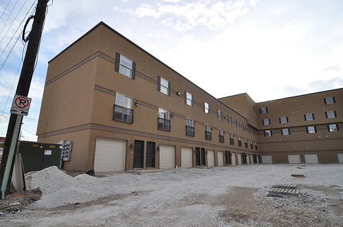
How did this happen? How could a plan that started as a promising project get turned into something that is a ghost of what was planned? Others have apparently asked the same thing. Construction has skewed so far off plan, that a work stoppage order was issued on September 9th by the Department of Code Enforcement (RE: Case #VIO10-101658). The description for this case is as follows:
FAILURE TO COMPLY WITH REGIONAL CENTER PETITION 2009-REG-029 CONDITIONS # 1, 5, 7 AND 8 AND FAILURE TO COMPLY WITH IMPROVEMENT LOCATION PERMIT ILP09-01774

Currently, the City of Indianapolis is working with the developer’s attorney to mitigate these issues. Work has since resumed on the interior as well as some drainage infrastructure but exterior work is halted pending reinspection which, according to the city’s website, is on September 28th.
Urban Indy will continue to follow this issue as it hits close to the heart of many area urban advocates.
———————-
Updates on 10/6/2010 via the IBJ: What do you think? City seems to be hedging on “NO”
I may be alone in this, but I don’t think the original design was much better than what we got.
This design isn’t salvageable without radical thinking. I don’t think this thing should be torn down.. the area needs infill too badly. I think this would be an awesome project for a taxpayer funded arts organization. Let local artists come up with a radical idea to make this a curiosity rather than an eyesore… I see an opportunity for something really unusual here.. maybe cover the thing with huge multicolored pinwheels? The developer should be made to pay for the improvements of course.
I’m serious here.. not about my silly pinwheels, but think what a competent artist could do with this thing!
I agree
I drive by this building just about everyday. I watched it go up. Its plain ugly. When they started to build it I thought it was a Motel 6 or something like that you see at an interstate exit. The city should have made them use more brick and a different color than what they used.
I’ve been calling it Motel 666.
I work downtown. I watched it go up too. Having worked in the construction industry, I can say that this is what happens when a project lacks supervision, and the developer lacks care. Meanwhile, I agree with most of the people on this page.
It is unfortunate that the City of Indianapolis allows such designs to pass. It’s clearly the simplest thing that could be built there.. Student-style housing close to IUPUI. Do people not question how this building will perform and look and age over time? It has been an eyesore since it first started to take shape.
Unfortunately, there is no quick fix. Nobody knows every single flaw, it is on all levels of construction, likely even from the first day.
THE BOTTOM LINE is this, folks:
Let’s stop approving these “temporary” structures that every sly developer wants to build. Let’s make building performance and LEED a requirement. And let’s care about our children as they grow in this society.
If our city is eager to approve infill developments like these, what will our city look like in twenty years?!
I agree Michael (and I also go by this almost every day) — the stone material is tacky to begin with but the fact that it was applied in such a perfunctory manner makes it even worse. The original design had the entire ground floor wall covered in stone.
I hate this building. If they built the original design, I probably still wouldn’t like it. But they really badly screwed up the design. For example, who decided that the long squat wall of the St. Clair frontage needed to be enhanced horizontally with those lines? It needed to be broken up vertically! As bad as the original design was, at least it got that right.
I could go on and on about how bad this building is.
This is quite possibly the worst attempt at multi-dwelling housing I have ever seen (I hope to never actually see it in person I may vomit all over myself). It is miserable on all levels: contexual relationships, massing, and detailing (I mean shutters, seriously). In a typical U-shaped urban building the entrances should be off of the inner court. They feel awkwardly suburban and out of context at grade and facing the street. If that many parking spaces are required in Indy they need to be handled in a parking structure, not individual garages. Whoever designed this building has never experienced a typical walk-up structure and their license should be immediately terminated (and by “license” I mean hairstylist license because that is apparently all they have ever earned).
I was extremely excited about this building as the framing was going up, but I’ve been growing rather displeased with its progress of late. I sincerely dread judging a building’s aesthetics before it’s complete, but so far it has certainly not been meeting expectations.
Last time I checked the website, they were renting the 2-bedroom townhomes for $1200 per month. Compare that to the apartments just north of Senate and Michigan ($600 per month) and it’s absolutely outrageous.
It seems like they were trying to appeal to a more upscale sense of design, but tried to cheap out halfway through. What a shame.
The design of this project was poor to begin with. It’s hard to believe that it could actually turn out much worse, but alas, the proof is before our eyes.
Obviously the lack of window coverage is a stark departure from the approved plans, and the tiny plastic shutters are just plain awful. Those are great observations about the apparent protrusions that have turned out to just be paint stripes. It really makes a difference, but did the approved plans actually provide architectural details, or was it just a marginally “pretty” picture?
WOW!!! As I drove by ‘Capital Motel 66’ I couldn’t stop myself from laughing. The first thought that came to mind (well, I can’t really admit this in public, so just use yourr imagination. Secondly, I asked myself, “How long will it take for this to get onto the URBAN INDY BLOG.”…Well, here we are…talking about what–in a city so deprived of good multi-family dwellings–may be the worst example of her type! Which says everything. Should I laugh? Should I cry? Should I imagine brown shutters as a future trend? Or should I just admit Indy is just too far away to invest in what’s right for a future urban living? Yes, this marks the truth of a dreary road building up to SUPERBOWL 2012: “Welcome to Our Worldclass City, Folks!” OK, maybe I’ll just keep laughing.
I’m almost wondering if this design is so bad that it will galvanize the like-minded forces in this city to start truly pushing for good design. Sort of a reverse of the demolition of Penn Station in NYC.
My guess is that we could probably see 50 comments with 50 distinct, egregious flaws in the design of this building.
The design is not worth discussing because there is none. I think city officials need to take a hard look at this as a perfect example of how much it takes to produce ‘nothing’. The sad thing is some people will never understand that good urban design can cost less than all of the bad suburtecture.
This building could still have a chance if someone could inform the developer that he should add dark brown brick all around the building up to about the second or third story , and leave the rest as it is . Then it would have a two tone two color efect, like the cosmopolitan on the canal has, and a hand full of other buildings that have that style. So hold your horses guys and not count this project out just yet.
Adding brick is difficult without a brick edge… “Oops, looks like that’s violation #501”
I fear that adding brick will not solve this problem. It is also unlikely they have accounted for that extra weight in their foundation design, so it might do structural damage. I guess they could add fake brick.
Installing the omitted color, texture, and trim details might help get this thing from an F back to a D+ or C-.
.
But that begs the question: how in the world did this thing get 90% built before a City inspector noticed the significant variances to plan? Clearly the foundation wasn’t poured according to the site plan shown above. Clearly the framing is significantly different from the approved design. Clearly there are windows missing on Capitol, and the window and door arrangements on St. Clair are not to plan. The big ugly two-window box isn’t in any plan. There are no sills or lintels or column details. The balconies and decks aren’t right. And these are just the obvious errors.
I’m most impressed that the city actually did anything to enforce the original pla!. I hate being negative, but this is the same DMD that allowed Walgreens to set a parking lot on a potentially prominent corner & then proceeded to allow CVS to build a only slightly better bldg across the street.
Can I finally have some hope that they are starting to grow some…..?
I emailed a few “planner” friends in Current Planning and this building is constantly being SLATED by that office and is definitely on their radar. Unfortunately, I don’t know if much will happen with the design, rather the developer will just be forced to amend the various petitions and approvals (at least based onmy past experience in that office). It’s too bad as this could be made a real example…I just don’t have too much faith in the RC approval process if this kind of development, just outside the Mile-Sq continues to happen!
Anthony Jackson: Your comment about just adding brick leaves me baffled. Why are people in Indianapolis so enamored with brick!! Sure it’s nice and little maintenance….but ONLY if used right. Because, brick in most cases here is not used right IMPO. For example, One of the worst examples of Architeture (for it’s PRIME location) is 3MASS AVE. The density is great, however the design and exterior materials used is atrocious! Walk by it along Mass Avenue and you wonder what’s inside. Is it a medical complex? Law offices? OR is it just the exotic cruise ship MASS AVE ARTS DISTRICT has been longing for!? Look at Lucas Oil Stadium. It’s nice to step back in time and mimic the influence of the historic fieldhouse like Hinkle or the Pepsi Coliseum. Is it great design? Definitely not the worse but in short, No it’s not. A building of this magnitude should be a bit more timeless, I believe. Brick is expensive and definitely justified in many designs but expensive materials do not make a bad design good or better in many cases. I’m no structural engineer or architect but it would be nice to rearrange the windows, doors and spaces with this building while ridding it of any decorative components. Then we would realize what the potential for SOLID, AFFORDABLE DESIGN in urban Indianapolis is. Indy architecture has very little transparency and is a romantic, gaudy facade for the most part.
This may look way out of place in a vacant Fisher’s strip mall!!
A travesty and a disgrace to the City of Indianapolis. This is certainly one of the most hideous residential buildings that I have seen anywhere in the U.S. Who is sleeping at the wheel in the City Planning Department and what kinds of checks and balances are in place to make sure that a developer does not deviate from approved drawings. Keep in mind, the initial design looked terrible, but who would of thought that this building that some people may call ‘home’ could be this crude.
The Department of Code Enforcement has responsibility for enforcing planning and zoning ordinances as well as inspecting buildings under construction for compliance with plans.
Who is the head of Metropolitan Development? And where does she/he live? I think that would be a start. Who is the head at the Department of Code Enforcement, and where does he/she live? And who is the developer who came ‘out of the sticks’ with this vision, and where are they from? The answers to these simple questions may tell a lot. When stuff like this happens the two words that come to mind is BRAIN DRAIN. What standards are we setting to retain people? But, I also agree that it will probably take a few more extremely bad projects for Indy to turn the corner for better design. Let’s just hope these last few aren’t half as bad. Certain people need to stay in the sticks and never come out!
Urban Indy aspires to be an inclusive community, we think everyone can find their place in this great city.
Please don’t blame the code enforcement department for a design problem. Indianapolis, as a governmental entity, has not been tasked by the community to enforce any standards of design or style other than those passed by the state and local building codes.
It may be a good idea to enact an urban design code at some point in the future, but until that time we can’t blame “government” for this problem.
This is most definitely NOT “a design problem”. It’s a developer and enforcement problem.
.
The building is in the Regional Center, where it is subject to the Regional Center Design Guidelines, a modern form-and-function based code. (A copy should be available from BSU CAP:IC, whose director was active in its development; it’s not currently available on the City website.) A design was approved according to the prescribed process.
.
The whole problem is that the approved design wasn’t built, and it wasn’t caught until the structure was almost complete.
Current guideline is available here:
http://www.bsu.edu/web/capic/urbandesign/
Unfortunately those are just guidelines, not a code. We need a stronger tool if we want to prevent structures like this going up.
Like an Urban Design Center who can weigh in and provide pressure to local developers…
Thanks for the information on the current guidelines. The mission statement and guidelines sound decent when read. Unfortunately, it’s guiding the design and development of this??!!!???! Seriously, bring on a TRUE Urban Design Center. Our city deserves better than having to learn from our own mistakes—which is very costly in many ways. Aren’t places like Indianapolis in a position to learn from other cities’ mistakes?
Yeah, that was my thinking as well. I think CDC Guy is right, and that the process can create buildings that are appropriate for downtown if the city follows through on their enforcement plans. But it seems in this case like the original design wasn’t that great to begin with. I think the reason that the enforcement wasn’t there is that we have not given the city officials enough of a mandate to prosecute these issues on our behalf.
The guidelines are a great step, but I still am hoping for some additional weight put behind them.
There may be foundation issues in the long run. Like the structure the foundation design was compromised.
In case anyone is still keeping up via this thread, Cory over at the IBJ has posted the latest submissions to the city regarding this project.
http://www.ibj.com/property-lines/2010/10/06/update-check-out-proposed-fixes-for-di-rimini-project/PARAMS/post/22700
After living in downtown Indianapolis for about 10 years before moving to Denver a few years back, I’ve got to say this tragedy of urban design happens in every city around the country. What is sad in this case is the level of design (dictated by the low budget and developer’s lack of community appropriateness) is not acceptable from the start – with or without the ‘fixes’ the developer has proposed. When projects like this get built, I say I’m glad to have left.
And this is the long term investment city officials don’t want to admit: Creative, affordable urban design with higher density (if designed properly) will actually attract a broader range of people and business, while giving locals a good excuse for not fleeing INDIANOPLACE.
From an economic standpoint, one can actually make a pretty sound argument that properly-designed buildings have a positive effect on other buildings surrounding it, so the net benefit to a city is larger than the individual benefits from constructing such a building. From the individual perspective, everyone wants to be surrounded by extremely impressive buildings but they don’t want to build them themselves (unless, of course, the company can gain prestige from building them).
Having a copious quantity of ugly buildings can establish a negative brand image. This piece in The Onion comes to mind almost immediately: http://www.theonion.com/articles/shots-of-indianapolis-skyline-to-depress-nation-du,17163/
Since ugly buildings are a net negative to the city at large, then it’s in the city’s best interest to encourage the building of handsome, well-designed buildings. To a degree, this would require subsidies of good architecture, to encourage companies to carry them out. An “ugly building tax” would also discourage builders from plopping down poorly-designed crap like the De Rimini while generating revenues for the subsidy program.
So, in sum, Indianapolis can no longer afford cheaply-designed buildings!
No wonder DMD isn’t impressed.
This building follows the simple formula of:
“When in doubt, just add expensive light fixtures and granite countertops…. that’ll sell it!!”
It got deemed uninhabitable by the state the other day. Guess we weren’t the only ones who noticed..
I think I know what the horizontal stripes are for… In the original design, the stripes were to divide each level.
Somewhere in the construction process, the fourth level was eliminated. If it had been left there, the number of stripes would have made sense. Instead, in the current configuration, there is an extra horizontal stripe in the facade. It’s just weird that it happened like that and nobody noticed, or nobody cared..
Absolute inpetness by all those involved. The developer, Di Rimini, is likely the biggets culpret in submitting one thing, then grinding the project its current sad, sad shape. The architect, JT Designers, should be ashamed for going along with the grind, but given the state of the economy, a paycheck is a paycheck. The City should be ashamed that such a reduced project through them and got so far along before being stopped, and should hold to their guns and get a quality project. The whole cheap residential windows, painted-on columns, cheap veneer stone, plastered on railings, that crazey upper floor massing with the cheap window, all make for a totally inept project. I am very sad that my old home town is getting a building like this.
It’s sad that cheaper materials could have been used than what’s there and the end result could be much better………for what ‘s worth. Way to go the safe multi poop-beige route, INDY!!!
Anyone know the current status of this project? Is the developer going to finish it? Does the city of Indianpolis have any control over when this has to be done or is it going to remain an eyesore until it’s condemned?
In the IBJ this week there was a small article stating that the lender for this project has started the foreclosure process.
If you are involved in this project in any way, I ask: Please, Please, Please do not implement the proposed “fixes” submitted in October! The original plan was poor, the current project is a disaster, but the proposed fixes are nothing short of tragic. Applying pretend columns is not, and cannot be, the solution.
I was trying to leave a photograph. hrmph. But I am with Brandon above, under no circumstances is that classic applique gonna help. This would turn a bad design into a disaster.
I know a gentleman that worked on the plumbing in this building. Nothing was up to code. He did what he had to do to make it right, but not under the eye of the builder or the city.
OMG, THIS IS THE FIRST TIME I’VE SEEN THE PROPOSED FIXES: CAN WE BE A LITTLE MORE PRETENTIOUS.
POOR INDY AND HER HEAD OFFICIALS WHO RULE…ALWAYS TRYING TO REVISIT SOME ROMANTIC PAST. LOL!!!! THE COLUMNS ARE A JOKE, RIGHT?!?!?!?!?!?!?!?!?!??
I’M REALLY STARTING TO FEEL SORRY (OR EMBARRASSED) FOR CERTAIN PEOPLE HERE.
WHY CAN’T THE CITY HIRE A REAL ARCHITECT TO FIX THE PROBLEM. I BET THERE ARE HUNDREDS OF LOCAL ARCHITECTS AND DESIGNERS WILLING TO VOLUNTEER THEIR TIME BY NOW.
Is this the first time you had seen those fixes? that isnt happening… the place is in foreclosure right now
Yep, first time. Who actually proposed this?
The form is contemporary in nature, but the treatment is cheap classic Indiana 80’s. Why is it so hard to grasp how easy it is to design simple, affordable contemporary dwellings? It should be cheaper than traditional materials. Especially within a developing urban context?
This is one of the cheapest looking buildings i’ve ever seen. Where were the inspectors when the facade was going up?
What’s the latest on this disgrace of a building? How long until it can be torn down and replaced with a much nicer empty lot? I saw a car pulling into one of the garages inside it the other day.
Not likely to be torn down.
.
I would expect an experienced urban developer to take it over (buy it out of foreclosure). Most likely a buyer would have to propose a decent exterior treatment and possibly some bulk or massing changes to move forward.
.
Whatever happens it won’t be soon or quick, as there will be zoning variances and plan approvals to obtain. Plus, I can think of two guys named Chris who will watch very carefully. 🙂
Any updates on this eyesore? I see it every time I drive downtown and it’s so depressing each time.
DiRimini is back in the news. Check out Property Lines blog post @ ibj.com
Yes this is a project gone down the tubes. But as we have recently learned public open means very little. Can you say JW Marriot..everyone hated it in the design stage. They said changes would be made. hmmm guess not looks as bad as the design sketches…horrible. The JW was even written up bt natonally know urban design expert. I have come to to call it the blue wall from hell.
Bow, I am not sure what project you are talking about with respect to the JW Marriott. It went through three major design changes due to public input. The original proposed design is vastly different from the much improved end product. I agree that the hotel is by no means a gorgeous building, but it looks very similar to many convention hotels you can find in most major cities, and it is not an ugly building.
There is no law, and there never will be, requiring beautiful buildings because beauty if purely subjective. However, there are rules and regulations about massing, shadows, heights, densities, energy efficiency, building materials, pedestrian access, historic preservation, etc. These planning requirements tend to result in better and more effective design, but they do not ensure beautiful or even pretty buildings. For example, San Francisco has some of the most rigid design and zoning requirements in the nation, and also a very active and engaged population that attends public meetings, speaks out on projects, and is not afraid to challenge them, including going to court to sue to stop projects, and yet even San Francisco has plenty of mediocre and even fairly ugly buildings. In short, you cannot legislate beauty.
As for the De Rimini, the issue goes beyond just an uninspired design, in this case, the developer actually broke the law by failing to even meet basic safety and building codes, and also built a structure that was completely different from the building plans approved by the city. It is not just an ugly building, it is an unsafe disaster. In this case, the issue was less about design review, and more about the city failing to properly inspect the project and ensure compliance as construction progressed.