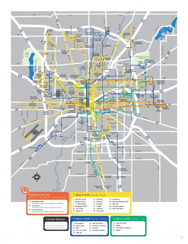
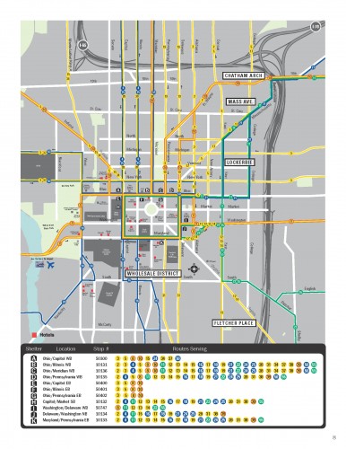
As one of the premiere transit blogs, Human Transit has been beating the drum of frequency maps for transit.  These maps prioritize how often buses run, where traditional transit maps show each line to be on equal footing.  I had even thought of creating a crude version for IndyGo that features their new lines that have improved bus frequency (which are still not as frequent as they should be, but that’s another story).  However, IndyGo actually has these maps on their website for everyone to view.  The PDF file explaining this can be found at this link.  The maps can be seen there, or below:
These maps can be helpful for citizens who wish to transfer upon the most frequent routes. Â I’m convinced that the maps could be made more visually appealing, but they are a good start.


I am a GIS student at IUPUI. I am trying to a project involving Indygo’s transit. Do you have or know where shape files or Autocad files of Indygo’s system map?
Thanks,
Richard Cornforth