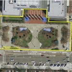
 Earlier this year, the City engaged a process to rethink the City-County Building (CCB) Plaza, located south of the CCB. Once home to the county courthouse, the plaza, developed alongside the shiny new home for local government, never managed to provide a great space for the public. Instead, the harsh materials, hostile green space, barricaded fountains and inaccessible pathways to the entrance of the CCB have created a barren environment and maintenance headache. On even the nicest of days, this space goes largely unused. It may serve forever as a memorial to design that was largely form-based, with little concern of function.
Enter the City-County Building Plaza Design Competition. Earlier this year, the City engaged the design community to rethink this space, both in design and function. Requests for qualifications (RFQ) and proposals (RFP) were issued with a very clear message; give us a public space we don’t have, a public space that provides year round activity for people of all ages, demographics and backgrounds. The challenge was set. Designers had a two-acre property to re-imagine. Some guidelines were established, such as a general budget, preserving and repairing the structural systems for the underground garage and interacting with, but preserving the Cultural Trail.
Responding to the challenge, 23 firms representing local, national and international interests submitted ideas. These proposals ranged from slight material and landscape modifications to significant structures housing commercial space, welcome centers and performance pavilions. Most designs included water features and more than one design created an elevated walkway across the plaza. While all designs had unique elements, there appeared to be three common themes to describe the majority. Some honored the design style of the existing building and its function by creating civic plazas. These were very stately, ordered, often symmetrical spaces. Others found a more playful way to create a mix of active and passive recreation. These spaces generally provided flexibility, both in terms of physical form and programming. Perhaps some of the most visually intriguing designs were those that developed something very iconic, whether in structure, or idea. These designs explored the very edges of what might be created, but often fell short when imaging function for all users.
Design professionals, community stakeholders and local government officials formed a committee sought out to judge, critique and ultimately, to select the top three designs submitted based on different criteria related to cost, sustainability, design aesthetics, function and the ability to activate the space. Proposals were provided to all jury members with the material requested and submitted by the design teams. These items were regulated during the submittal process to ensure consistency throughout. Jury members were not provided information on the teams that submitted the designs, simply the concepts and renderings for each design. through open discussion, intense study and certainly a fair share of passionate debate, the jury worked to narrow down the focus. While all designs were considered, only three would be selected as finalists.
It became clear that each jury member had different ideas about their expectations for the plaza. These ideas were refined during the review process, often times, jury members would reconsider designs originally dismissed through initial rounds of review. As time passed, a common theme began to emerge. We need to develop the community’s back yard. We need an active space to engage residents and visitors throughout the year. The three finalists represent very different design ideas.
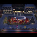
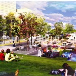
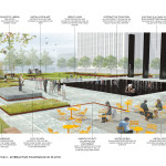
The third place design creates a modern twist to a civic plaza. The formal setting provides a central focal point with an interesting light display during the night. While the renderings of the space at night were some of the most appealing, the jury felt the overall design lacked functionality and failed to provide a wide range of events, activities and programming.
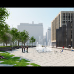
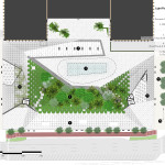
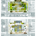
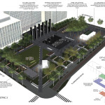
The second place design was one of the most intriguing and visually stimulating designs of the competition. In an effort to change the landscape of the plaza, the east and west edges would be curved upwards, as if extruded from the ground. This design created something similar to a quarter pipe, for those familiar with skateboarding or stunt bicycling. Various spaces were created within this newly formed bowl intermixing water features, landscaping and passive recreation areas. The central spine would serve as a spray fountain and the main path to the CCB entrance. While this design was a great imagining of the possible, it also created very real functionality issues related to slope, programming, maintenance and cost. Additionally, the jury was concerned with the impact the raised edges would have on the adjacent Alabama and Delaware streetscapes.
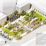
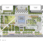
So, that leaves us with the first place design. A design that the jury felt created the best combination of form and function. A design that best created a community backyard, while also honoring the civic duty it represents. Three distinct areas were created including a large open lawn space, a central water feature and a commercial structure component adjacent to a landscaped area, termed “The Grove”. The design incorporates active and passive spaces for all ages. Art, intermixed throughout several different spaces allows visitors the opportunity to explore the plaza. A large interactive fountain provides an engaging area for those young in age, and young at heart, converting to an ice rink during winter. The plaza pays tribute to the old courthouse, with a soft red outline of the building and symbolic steps near Washington Street. In the end, this design is what downtown deserves.
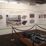
The designs as well as a 3-D model of Market East are being released today at 10:30 at The Hall for the public to view. I encourage anyone who can make it to check out the new exhibit.
It’s a good design and would be a great addition, not completely sure if it was a homerun. Neat!
About the 2nd place design: “Additionally, the jury was concerned with the impact the raised edges would have on the adjacent Alabama and Delaware streetscapes.”
I feel that, if approached right, this could have been a huge boon for the Delaware and Alabama streetscapes actually.
First a little background, I traveled to Paris for my honeymoon, many years ago. One of my favorite parts was going down a side street which was lined with tiny little shops. The inside of the shops were maybe 8-10 feet wide and about 10-15 feet deep. Each served a very specific purpose – a wine shop, a little cafe with only coffee and croissants, an olive oil shop, a jewelry shop, etc. Paris is an expensive city, so these little shops provided the shop owners with a small inexpensive place to set up.
When I set up my small business, I looked at locations near Monument circle, but they were all huge for what I needed – 1500sqft for $2,000 or more. I currently have a kiosk that which takes up about 50sqft which is all I really need.
So back to the 2nd place design. I could definitely see the eves of the 25ft part having little microshops under it. Each one could be 8-10 feet wide and rent for a couple hundred bucks. It would be amazing to see what sort of businesses would pop up with that kind of rent and small space. You might get some very niche businesses that would otherwise not be able to hack it in a larger, more expensive space.
Also, Delaware and Alabama’s streetscape and street life will continue to be anemic until they are turned from one ways to two ways – especially the Delaware St racetrack.
It would be nice to have some links to larger images of the 3rd place design.
1st place is decent and has a good program of spaces. A conservative, safe design approach that seems a little disconnected throughout the space without much continuity, but will serve as a good dwtwn park space for workers and residents of the area.
Is there any rhyme or reason behind the diagonal walkway in the winning design? It just looks so out of place. Like it was copied and pasted from another scheme.
Consider that many people will approach the CCB from the transit center once it is complete. They will cross at the corner of Delaware or Alabama and will find a way to walk directly to the entrance. There is a paved plaza from the Alabama corner so no need for a defined path.
Rather than being “copied and pasted”, the “Delaware Diagonal” reflects the absolute human nature to seek out a direct path to the door. I commend the designers for recognizing that. Too many landscape designers don’t.
Right, I agree with Chris on this one. A lack of a diagonal path to the door from the corner in the current plaza is one of its many failings. Notice that the southern half of the state house plaza contains them.
I remember years back, Georgia State University (I think) had a courtyard between several buildings. that they wanted to use as green space. Rather than put sidewalks, trees, benches etc. in where they thought they should be, they simply laid sod across the courtyard for a summer and encouraged students, faulty and staff to walk on it.
At the end of summer, it was clear where the natural walkways were as they were all worn and dusty and grass free. The university then laid sidewalks in those areas, and placed trees, benches etc. in areas where they would most be utilized.
It was interesting looking at before and after pix. The original places where they thought they’d have to put sidewalks were all wrong. Also, there were lots of smaller sidewalks that no one thought would occur. Walks that were used by obscure staff members who would take shortcuts multiple times a day. Those mini sidewalks were also created.
This would be an excellent change for the plaza. Thanks for sharing the winning designs.
It would be nice if plans for this plaza and the new transit center incorporate the somewhat forgotten President’s Park in the triangular space southeast of the Alabama and Washington Streets intersection. George H.W. Bush planted the tree there in honor of Ryan White.
I’m afraid that the once thriving tree planted by GHWB has already been removed with 40 other established trees along Washington St.
Its too bad the transit mall and the cc park couldn’t have been looked at simultaneously. There may have been an opportunity to coordinate circulation.
The timing was off, but I can tell you that people at the city see these as complimentary projects. The plan is to dedicate the transit center and walk across the street and turn the shovel on the CCB plaza.
That park is sponsored by Ford. Only a car company could think that park is a nice park considering it is at the corner of two heavily trafficked one way streets that until recently had three parking lots and an under-utilized plaza on the corners.
Honestly, until they did some sort of dedication last year, I had no idea that was actually a park. I’ve only seen one use of it – a homeless guy sleeping there one time.
3rd Place scheme can be found here:
http://arandalasch.com/works/light-field/
interesting. great illustrations. thanks for sharing!
No problem. What it be too much trouble to link higher res images to the thumbnails as you did with 1st and 2nd place? Thanks