“FRASIER: Remember when you used to think the 1812 Overture was a great piece of classical music?
NILES: Was I ever that young?â€
-Â Â Â Â Â Â Frasier, 1993.
The recent press releases about the city-subsidized proposal for redeveloping the downtown IFD parcel along Massachusetts Avenue have generated an above-average level of buzz, both here, the Indianapolis Star, and—perhaps the most heated of all—the Indianapolis Business Journal’s Property Lines, which first featured a rendering of the winning proposal by local firm Schmidt Associates, followed a few days later with a rendering of one that the City did not select. Both articles elicited dozens of reader comments, debating on which of the two designs was superior. After scanning these impassioned comments—two representatives for the losing team among them—it seems obvious that the designs have polarized that segment of the city who cares about this sort of thing, with verbiage ranging from “energeticâ€, “iconicâ€, and “colorful†to “cruise ship†and “Las Vegas†applied to the winning bid, and “better variation†and “perfect context with its surroundings†to “tedious extended roof lines†and a “1960s-era dorm at a third-rate business college†applied to the losing one. As I remarked a week ago, when fellow Urban Indy blogger Kevin assembled our opinions on the winning proposal in a single post, I’m withholding most of my opinions on the appearance of the building, not only because the forthcoming design hearing process (Metropolitan Development Commission and the Indianapolis Historic Preservation Commission) will inevitably result in some modifications, but because—to be frank—the results of any debate on aesthetics will feel like a Pyrrhic victory at this point. Do individual opinions on a building’s appearance have any bearing, and should they?
I know that I’ve just exploited the argument by inserting such a rhetorical question, and it’s hardly fair of me to do so, considering I’m contributing for a blog that deliberately hosts personal opinions. Rather than answer the question, I hope simply to thicken the stew by reminding readers of another recent architectural event.
Before we throw any more hats into the ring on the Mass Ave design, remember that just two weeks ago, Indiana Landmarks hosted a Pop-Up Mod Tour to inform the participants of the history and architectural details of some of downtown’s most recognizable construction from the Modern era. This thoughtfully prepared free event did not get promotion on the front page of the Indianapolis Star the way the Schmidt IFD proposal did, but it raised the visibility of other prominent buildings in the City for the 50 or so people who attended. The unconventional approach allowed participants to decide which buildings interested them the most—they’d use this map to find their ways to the six featured structures, where a docent would provide a history and answer further questions. I’ll briefly review these six structures in the sequence prevented in the Pop-Up Mod Tour map, providing just enough historical background to form a judgment about where they fit in the broader aesthetic estimation of the community.
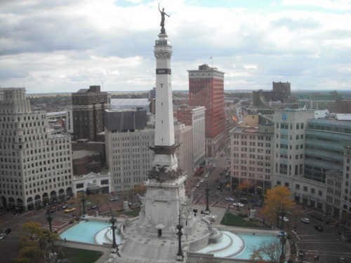
1)Â Â Â Monument Circle Landscape
Â
Before the Soldiers’ and Sailors’ Monument occupied the centermost point in the city in 1901, it hosted a largely symbolic Governors’ Mansion and then a Circle Park. By the 1970s, the appearance and condition of Monument Circle had deteriorated into little more than a nondescript roundabout. The City hired Alan Day of Browning Day Mullins Dierdorf Inc to design a complete overhaul of the streetscape, giving him considerable freedom to install or improve traffic calming devices that made the monument and parcels surrounding it more accessible to pedestrians.
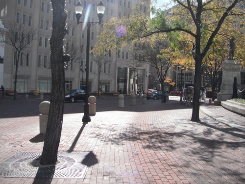
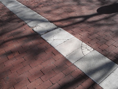
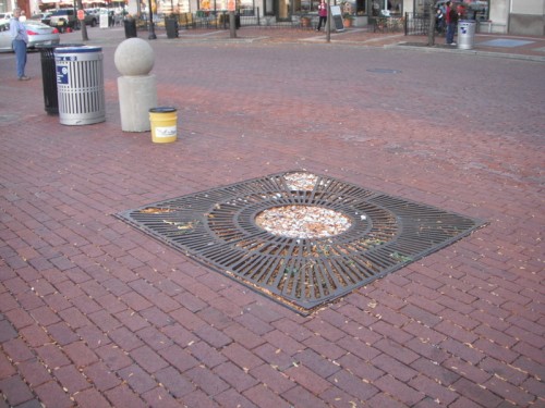
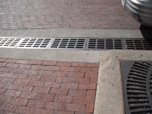
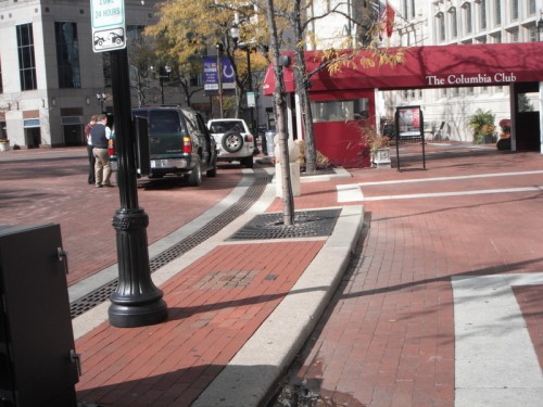
This much-loved public space has rarely generated controversy for the aesthetics. Although recent local competitions have sought a rethinking of the circle to help enliven it with more activity, few have objected to the physical appearance of Monument Circle. Stay tuned, though: some planned alterations spearheaded by the Department of Public Works over the next few years will almost definitely arouse criticism.
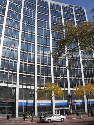
2)Â Â Â Chase Circle Building
Â
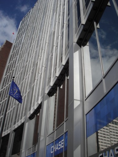
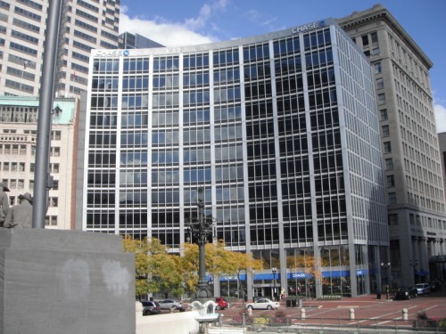
Originally called the American Fletcher National Bank building, this 1959 structure was the first downtown to employ a curtain wall. Its concavity—echoing the curves of Monument Circle, paralleled the appearance of older structures on the Circle’s southeast corner. Designed by Skidmore, Owings and Merrill (Nathaniel Owings was an Indianapolis native), it remains the most recognizable example of the International Style in downtown Indianapolis. The Chase Circle Building does any degree of condemnation in the public eye that I’m aware of, and, integrated with the adjacent Chase Tower since 1990, it appears likely to endure well into the future.
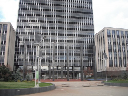
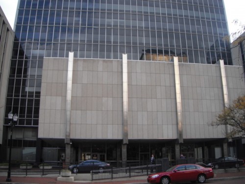
3)Â Â Â Indianapolis City-County Building
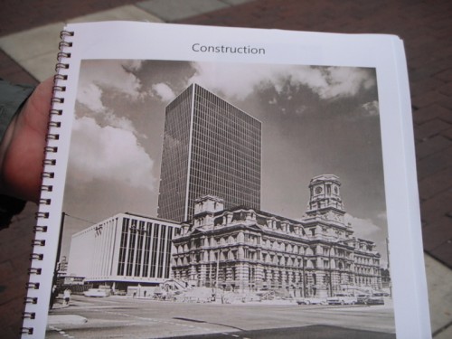
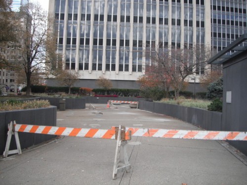
Among the more controversial of the mid-century additions to Indianapolis downtown was this significant expansion in capacity over the original City Hall (still standing two blocks to the north) and Courthouse (demolished to make room for the CCB). In my negligence I failed to capture a photo that encompassed the complete structure, but INArchitecture offers a good one, as well as a more involved description of its history.  Completed in 1962 by the local firm Wright, Porteous and Lowe (now defunct), it echoes much of the International Style gestures visible in the Chase Circle Building, but the fact that it replaced such a monumental structure as the original Marion County Courthouse—now a drab, poorly maintained plaza to the City-County Building—has turned off a significant portion of the population from this building entirely.
Â
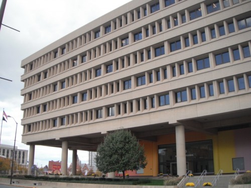
4)Â Â Â Minton-Capehart Federal Building
Â
This 1976 development occupies a lower profile among the city’s modest collection of modern buildings than one might expect, considering it is an archetype of the Brutalist style that was hugely popular at the time. Local firm Woollen Associates (later Woollen Molzen and Partners Inc., which folded just last year) designed the structure in an inverted ziggurat shape, echoing the roof of the Indiana War Memorial building nearby.
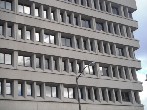
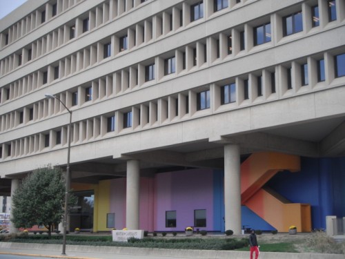
Brutalism fell heavily out of favor by the mid 1980s, and by most metrics, it has only modestly reclaimed some consideration of its merit as an architectural movement, while seminal structures like the Christian Science Church in Washington DC face the wrecking ball amidst preservationists’ opposition. Aside from its loyal Brutalist fan base, much of the community perceives the Minton-Capehart with indifference or disdain. Like most Brutalist structures, it has little positive to offer the streetscape in terms of urban design, but as a standalone structure it would be hard to claim it is without merit in its own right.
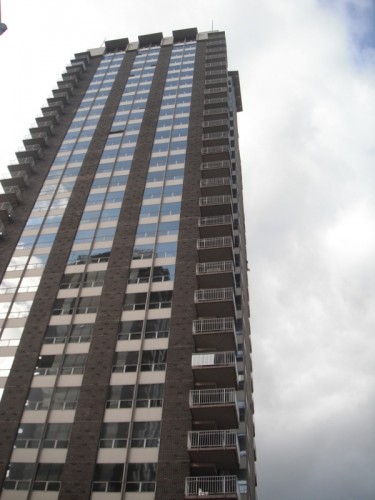
5)Â Â Â Riley Towers
Originally part of the James Whitcomb Riley Center, an expansive “campus†of 10 towers of 30 stories each, market cycles forced a retraction to two 30-story towers and one broad 16-story building, completed in 1963 by the Chicago firm Perkins + Will. (The remaining land originally set aside for 8 more towers became the Renaissance Place development in the 1980s.) They remain the tallest residential structures in the state, and continue to attract a middle to upper-middle income clientele.
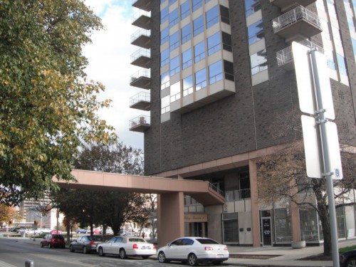
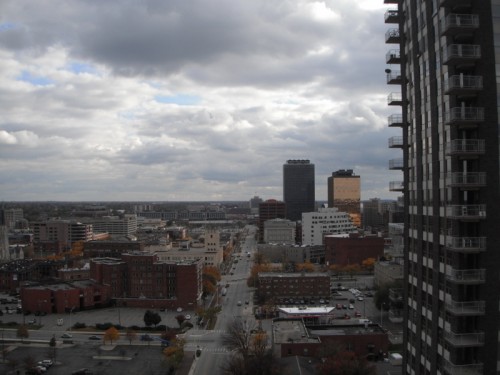


The fact that the surrounding neighborhoods have evolved into some of the city’s most fashionable no doubt sustains the Riley Towers’ attractiveness; it also helps that nothing has yet surpassed them in terms of high-rise residential construction. The general reputation of the towers is wedded to the student and urban professional demographics that inhabit them.
6)Â Â Â Barton Tower
Â
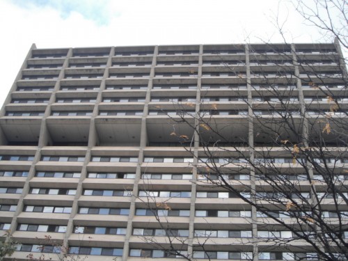
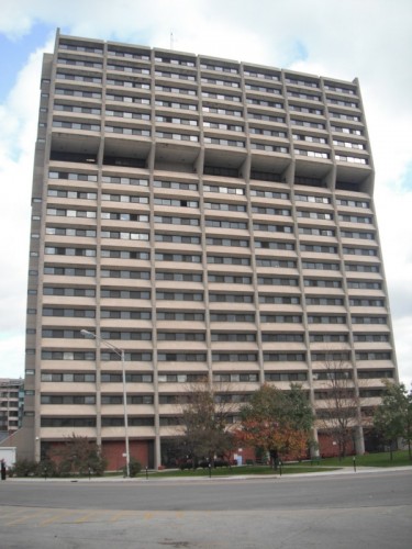
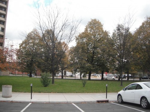
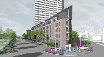
Indianapolis was the largest city in America lacking a major public housing development when Woollen and Associates built the Barton Tower in 1968. It overtly belongs to the same Brutalist tradition as Woollen’s aforementioned structure, the Minton-Capehart Federal Building; however, unlike the Minton-Capehart, the Barton Tower’s floorplate only occupies a small fraction of the parcel and block. Over the last decade, the City has evaluated various development proposals for the remaining land (now used as green space), with local developer Flaherty and Collins submitting the winning bid, resulting in this rendering introduced over the summer.
Architectural Aesthetics within the Hierarchy of Taste
Â
This structure, the final in the Indiana Landmarks’ Pop-Up Mod Tour, provides the ideal launch pad for an evaluation of aesthetics and shifting taste cultures. Of the six projects featured in the tour, the Barton Tower almost definitely elicits the most consistently negative reactions. I personally have never been a fan of it myself. But I deliberately participated in this tour because I wanted to challenge my own prejudices by hearing well-informed and impassioned docents explain the merits of these structures. After attending the tour, I remain unconvinced that the Barton Tower is some sort of Brutalist exemplar; the Minton-Capehart building, among others, offers more visual interest in my opinion. But I can at least recognize the energy created by the play of shadows upon the windows, as well as the level of consideration devoted to organizing the interior space in this milestone of Indianapolis public housing. Whether it is the apartment’s focus on an elderly low-income demographic, superior design, or simply good management, the Barton Tower has avoided that reputation for lawlessness and sub-standard conditions that characterized high-rise public housing in cities like Chicago or St. Louis.
The polarized reactions that the Barton Tower elicits only help to underlie an important dichotomy between the building and its spatial context. I’m no architect, so it is much harder for me to appreciate a building on its own terms, if the urbanism that surrounds it—and the urban design it is predicated upon—is a near failure. The fact that the tower creates what most perceive as a “dead block†smack in the middle of one of the city’s most vibrant retail and entertainment corridors has largely spurred the City’s desire to dispose of the surrounding pocket park through a new development, an initiative most people in the community seem to favor. Take a look at the proposal for the Barton Tower green space once more:
The new structure engulfs the old, and practically no one seems to care. (The few who object these days mostly do so on the grounds of keeping the grass and trees—not out of any desire to preserve the standalone visual integrity of the Tower. Only a small cadre of committed preservationists and Modernist advocates has voiced much concern for the tower itself.)
Under basic code enforcement considerations (availability of fire escape paths for residents of the tower, accessibility of sunlight to the lower floors), the architects will probably have to modify the proposed wraparound design somewhat. But few others have come to the edifice’s defense. In the shooting gallery of public opinion, the Barton Tower’s architectural strengths simply cannot nullify its urbanist shortcomings. Urban advocates and city planners do not hold the modernist Le Corbusier in nearly as high of regard as most architects (probably quite unreasonably), because his utopias helped to conceive the sundry sterile high-rises that preside over their green space without ever really clarifying a sense of who owns it. At best, the open space surrounding these towers would remain unused and neglected (and often quite chilly due to wind tunnels created by the buildings themselves); at worst it became a literal gauntlet for snipers perched on the towers.  Corbusian ideals galvanized public housing throughout the 1950s and 1960s, and its empirically obvious failures in promoting urban vitality or even basic levels of safety for its residents culminated in the destruction of St. Louis’ Pruitt-Igoe Complex in 1972, which ushered an era that depleted a sizable portion of American high-rise public housing stock. Chicago has demolished most of its towers in the park: Cabrini Green and the Robert Taylor Homes, both massive public housing developments characterized by crime and substandard living conditions, succumbed to dynamite over the last 20 years.
As is always the case, the built environment is subjugated by competing and shifting taste cultures. Across the street from the Barton Tower, the Fire Department proposal suffers from a perception problem that is the inverse of Barton Tower. Here again is the rendering that has generated such a brouhaha:
The urban design for this parcel is good—flush with the parcel’s edge, reasonably high density, significant space devoted to street-level retail, smartly concealed parking underground. But opinions on the appearance—“Mickey Mouseâ€, “screams 1990sâ€, “trendy blahâ€â€”ouch. Those sting. Defenders of the project don’t like such belittling labels, so the debate continues on various blogs ad nauseam.
Do these dialogues help us improve our collective understanding of what constitutes good architectural aesthetics? I would argue no—not because we have nothing to learn from one another’s opinions, but no single bundle of opinions has greater merit than another, when the discourse can reduce them both to hierarchically organized units of taste. Licensed architects can often understandably craft a more compelling argument than laypeople; thanks to their training, they have a broader array of intellectual context from which to draw. But that doesn’t make their opinion more legitimate if the project faces other constraints such as financing, site control, zoning/code compliance, viability meeting a core market demand, or, yes, even obtaining the right political connections. Everyone with skin in the game tries to gussy up his or her individual opinions toward aesthetics by integrating enough contextual references to give these opinions the guise of objectivity. But the modernists who argue the City-County Building, Minton-Capehart, and the Barton Tower are unappreciated relics from their era have no greater claim to authority than the neo-traditionalists who would like to see those structures annihilated for something cozier. Nor do they have any less of a claim.
By all means, the discourse on aesthetics should continue—it can help us refine our understanding as individuals, even if we get nowhere collectively. I encourage those who feel strongly about the design not to hide behind their computers and help shape and thereby democratize the design process. And a savvy development team should welcome perspectives that might help the final product become more saleable. But no level of handwringing over Indy’s “lack of civic engagement on design†can necessarily guarantee one expert’s subjective critique cogency over another. After all, online critics have branded the Schmidt proposal as both “trendy†and “dated†in equal measure, confirming the fungible nature of aesthetic judgments that are tethered to collective interpretations of time.
Is it possible architectural aesthetics share a trajectory with contemporary fashion, the two movements orbiting together around the prevailing culture’s critical gaze? Architect and Indy native Michael Graves enjoyed a steady ascension in the public eye during the 1980s, as colorful postmodern gestures like the Humana Building in Louisville and our NCAA Hall of Champions endowed his firm with a brand nearly recognizable by the mainstream. Then he suffered two almost lethal setbacks: postmodernism ebbed as a movement and immediately dated its buildings; he submitted designs for mundane household products that everyday Americans could purchase at Target stores. This latter decision no doubt transformed Graves into a pariah among the intellectual design elite: by deferring to middlebrow tastes, his artistic message had about as much legitimacy as a Bill Cosby sweater.  For all the naysayers regarding the Schmidt design of the IFD station, bear in mind that if one of the alternatives had won, we’d all be participating in the exact same dialogue. And if the City of Indianapolis had genuinely chosen something “cutting edge†(whatever that means) for the winning proposal, it, too, will appear dated in a decade or two. (In fact, the more timely it seems now, the more it will date itself.) And then, after the backlash has subsided in another twenty years, the design will exude retro chic. After all, Norman Rockwell and mid-century modern are enjoying a critical resurgence right now; Brutalism is timidly beginning to assert itself; and no doubt the highbrows who scoff at Michael Graves’ corpus will someday subject it to an appreciative, nostalgic re-evaluation. And Bill Cosby sweaters will become hip again too.






The Schmidt proposal is a huge disappointment for the obvious reasons but it does not compare to the proposed wrap around the Barton Tower development: a sterile, homogenous building which doesn’t fit Mass Ave, but worst of all…does nothing to improve the existance of Barton Tower. Missed opportunity is an understatement. Get the proper local architects involved or go out of state to accomplish real design for this prime lot! Mass Avenue is going downhill.
Treat the corner as PRIME REAL ESTATE: 8-10 stories at the prime corner with views of Downtown, the Murat and Athenaum in mind; step down to 5 stories toward the tower to allow proper sunlight; break up the facade to fit in with BOTH historic and eclectic nature of Mass Ave.; allow for open courtyard in middle of building for relief; use modern form & contemporary finishing with greater transparency to properly blend in with the brutalist Barton structure.
This site should be an architects dream, yet the city treats it like a nightmare? Seriously?
8-10 stories, agreed.
Great survey of downtown Indy, thanks for this!
Seriously, that looks like a giant jar of peanut butter. What are they thinking?
Thanks again for all your comments. I agree that it would be desirable to see an 8-10 story structure (i.e., a REAL midrise) in one of these two locations. Unfortunately, state building codes limited wood-frame construction to four stories, which is why we have so many five-story apartment buildings downtown: retail with four floors of residential on top. Higher developments require metal frame construction, and the costs for this are unsupportable in terms of market absorption, especially given the economy. The IBJ released a (locked) article on this back in July: most Midwest cities cannot support metal frame developments unless they are super-tall or luxury, neither of which are marketable at this point.
.
Furthermore, various neighborhood associations and historic preservation groups have used the Massachusetts Avenue Commercial District status with the NPS as a means of controlling anything that is perceived to be “out of character” with the existing context: more often than not the neighborhood groups like Chatham Arch and Lockerbie have used to it force projects into lower heights than the developers originally proposed. Developers would typically love to build the “highest and best use”, which usually equates to density, but anti-density NIMBY sentiment is powerful. Perhaps someone else is better versed than I am to provide the details, but I believe 3 Mass managed to slip by simply because the it fell outside the Chatham Arch Neighborhood Association boundaries, or they failed to organize in time. Most likely it would not have passed if a developer had proposed it in 2012. Critics of 3 Mass’ design might say it’s a blessing, but at least it is a bold midrise statement in an area where the bureaucratic obstacles only seem to grow with each passing year, preventing further iterations.
.
My strongest recommendation is to follow the progress as these two buildings pass through additional hearings, and pry yourselves away from those computers if you genuinely feel your opinions deserve recognition.
Cross-laminated timber (CLT) could make building the high-rises less expensive (and even Eco-friendly with proper forest management). Europeans have built 9 and 10 story structures with CLT, which is basically engineered wood. However, it will take some time before our code gets revised and before CLT gets produced on a massive scale (bringing down the cost). Here is a good article about it from NYT:
http://www.nytimes.com/2012/06/05/science/lofty-ambitions-for-cross-laminated-timber-panels.html?pagewanted=all&_r=0
Eric – I agree with your assessment. That’s why I usually put more emphasis on density, mixed use, quality of materials, parking, infill, etc. There are so many examples of buildings that when first built were hated by the general public only to become iconic later on.
And what are some of the examples? Just curious.
Micah–
Just offhand, I can think of two examples in Paris. I.M. Pei’s pyramid outside the Louvre was hugely controversial when it was first built–now it is iconic. Almost a century earlier, the Eiffel Tower elicited disgust when it was unveiled. Now it is impossible to think of Paris without it.
The Sydney Opera House may not have been hated for its design, but it was certainly maligned for bankrupting the state due to possibly the poorest project management in the history of the world. It was a disaster due to cost overruns, and many Australians are still sore about it. But as a structure, it is as much a part of Sydney as the Eiffel Tower is to Paris.